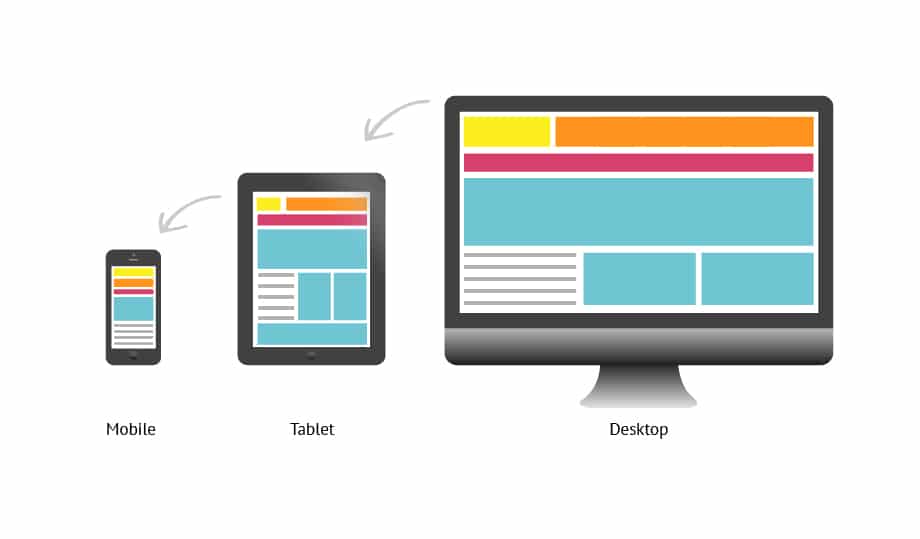
What is a Responsive Design?
In earlier times, two different techniques had to be used to create a desktop website and a mobile website. But with the introduction of smart browsers on desktops, the work was simplified. And this made it possible for single and customized websites to be created for both desktops and phones.
“Before deciding to create a website think about what your site design plan will be!”
Static Design (Fixed Design)
Websites that are static do not change if you change the browser size, or if you are viewing the same website on the phone. The content on that website when you are using a smartphone, will be very difficult to see. You have to rotate the phone horizontally and vertically just to read or view the content. These types of websites have been built a lot until the fluid and responsive designs “came to light”.
Fluid Design
When we resize the browser, the content on the page is spread all over to fill the space you have set up with the browser. The columns containing the content on those web pages are constructed using percentages, unlike static columns. For example, when you zoom in on a web page one of the columns will disappear or go to the bottom. (Try porositweb.com on Google Chrome Ctrl + & Ctrl -).
Responsive Design
This approach aims at designing the website in order to make navigation and reading of the content as easy and understandable as possible. This avoids the need for the user to enlarge or move the browser through the contents of the web page. Essentially the website will be much more usable and readable on computers, smartphones and tablets. With the creation of a responsive website, designers do not need to design two or three web formats that are rearranged for different devices such as pcs, smartphones etc.
In this type of design the images are also downloaded based on the internet speed we have. For example, if a video is being watched in a country with very low internet speeds, that video will be viewed at its lowest quality.
Which one is the best for my company?
Companies need to analyze from which devices are their targeted audience.
For example: if your customers aren’t visiting your companies website through phones, don’t bother paying big bucks just to have a responsive design (compatible with any pc, smartphone, ipad etc).
But as you know, the use of smart phones is growing every day. So consider designing your website with a responsive design. Prepare your website to be as convenient and easily viewable on any internet connected devices.
We tried to make it as simple as possible, so you can understand the importance of a responsive design. But if you have any sort of questions please fill out our contact form and we will get back to you as soon as possible.
If you are a web developer and your looking to learn on how to make your site responsive, you can learn how to on https://web.dev/responsive-web-design-basics/.


